Ever since James and I sat down and worked out the nuts and bolts of the game, we’ve had a really clear concept of the setting. It was one of the first things we agreed on and we’ve tried to preserve it in the style of the logo, character design and make sure it runs through the whole look of the game.
Imagine, if you will, a 50’s style future-now, with old-style robotics feel that gives it a grounded but sci-fi feeling. Influenced by things like The Jetsons, Fallout and BioShock, we wanted something that felt nostalgic but had weird and wonderful sci-fi elements.
Doing the R&D for the visuals was eye-opening and I discovered an array of incredible comics, books and film that informed the aesthetics of the game. Check out this amazing comic book series which started in the early ’60s but had a resurgence in the ’90s. Magnus, robot fighter has an amazing style to it which I really fell in love with.
What’s been even more rewarding is seeing how our graphic designer and artists have interpreted this brief in their own way. It gives the games its own look and style. It has evolved beyond the 50’s-style Forbidden Planet looking robots, into its own thing. I’m loving the direction that this game is taking and I can’t wait to see it all together!
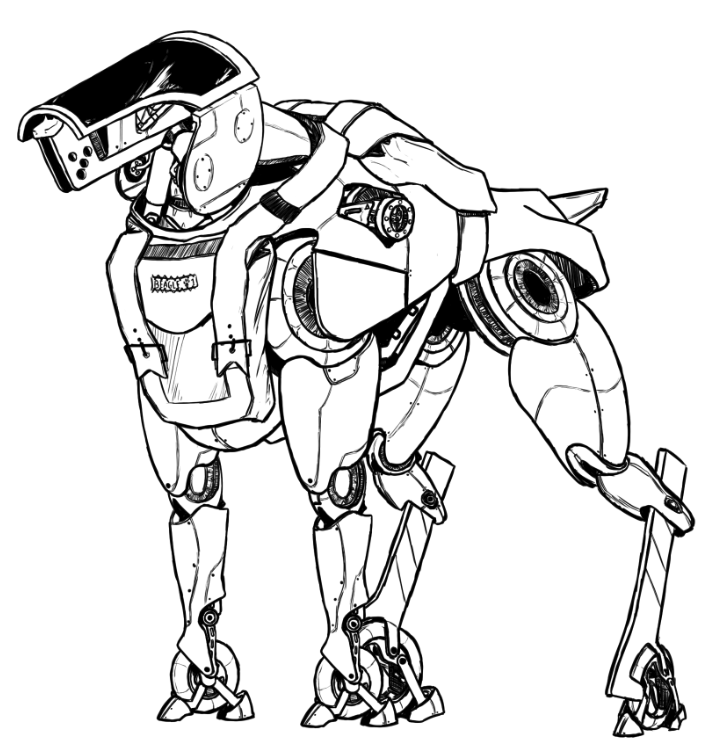
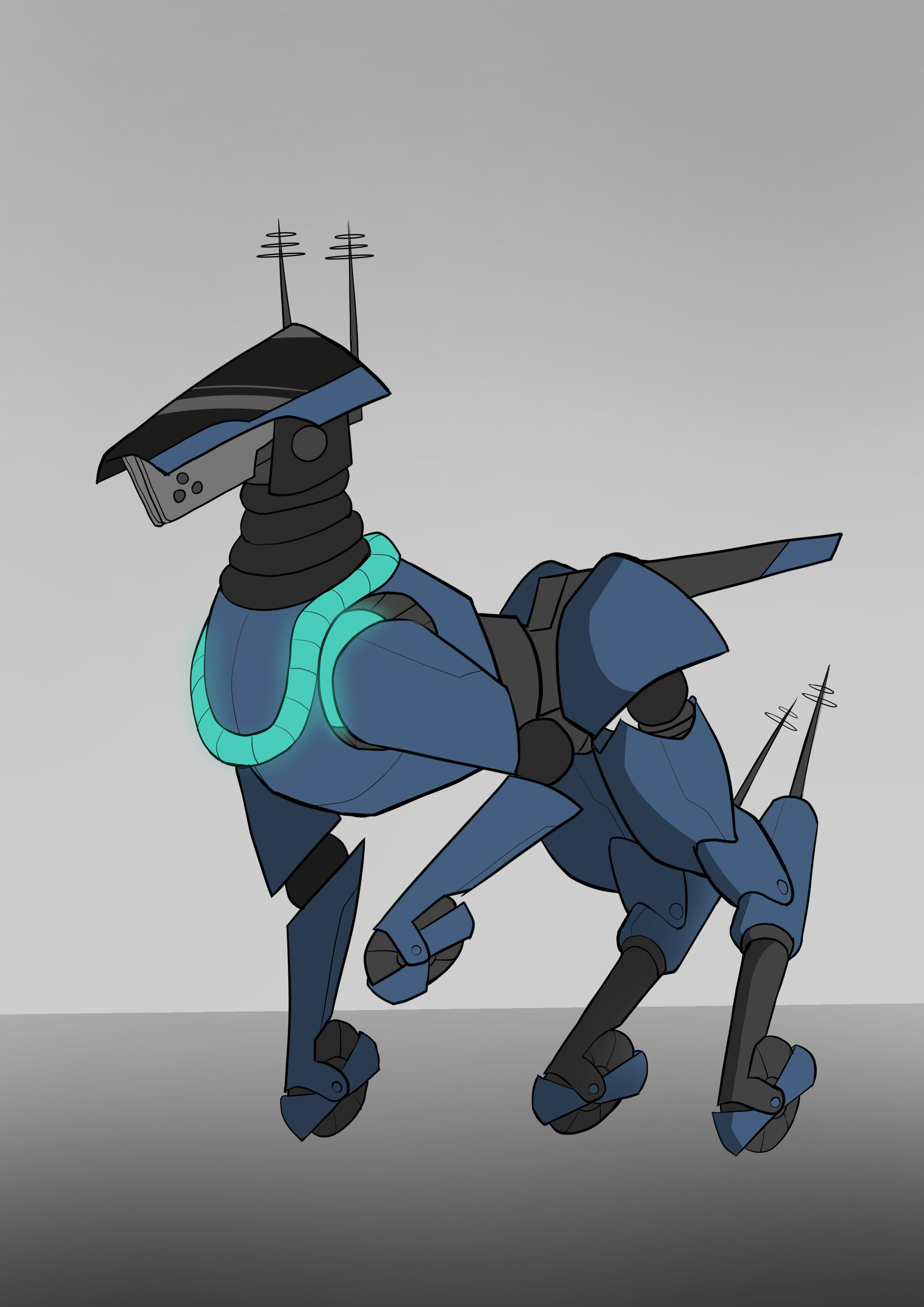
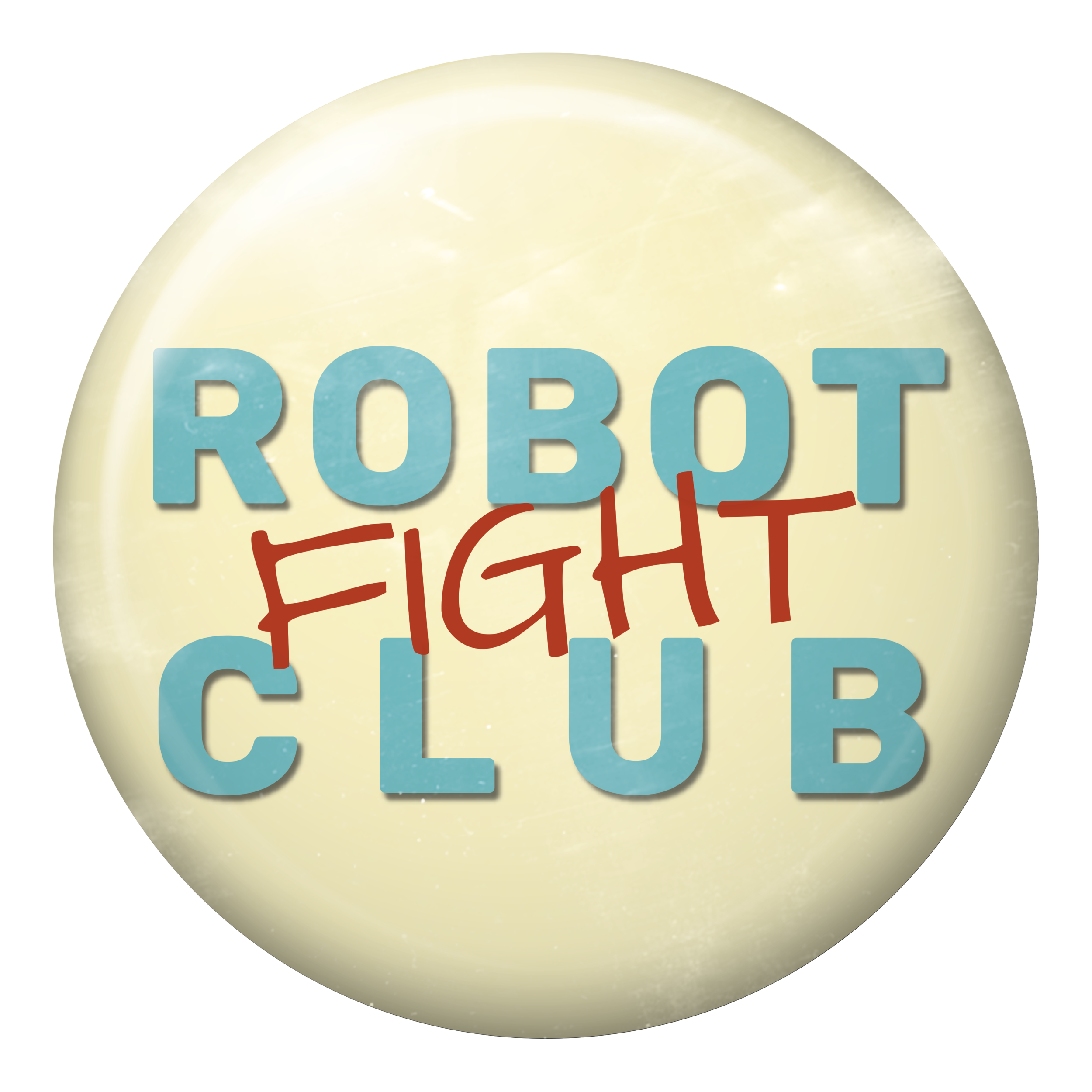
Here’s just a small selection of the work our talented group of artists and graphic designer have created. I think it’s amazing to see the concept and final version of Beagle next to one another, plus the latest Character design, Hanna ready to go. Hanna, also the name of our graphic designer, has done an amazing job with the logo design and this is a pin badge design that will be used in the game. She used 50’s roadside diner signs as a source of inspiration for the colours and font style.


