I've never really considered it, but I'm pretty lucky when it comes to my senses. I had a test recently, and was amazed to discover that (despite many years of DJing in loud clubs) my hearing is more or less spot-on. My sense of smell is (often regrettably) pretty decent, and neither touch nor taste has ever given me any issues. My vision's a bit naff, but as long as I'm wearing glasses there's nothing I can't do - and even if I don't want to wear them, contact lenses are an option. So yeah, all things considered, I'm pretty lucky.
My grandad was colour blind, and when I was little there was always a worry that it would be passed down to me. I was lucky, but my cousin inherited it, and according to a quick google it's as prevalent as one in every twelve men in the world (and one in two hundred women). In other words, it's surprisingly common! And yet, it's something that the board games world is only just starting to take into consideration.
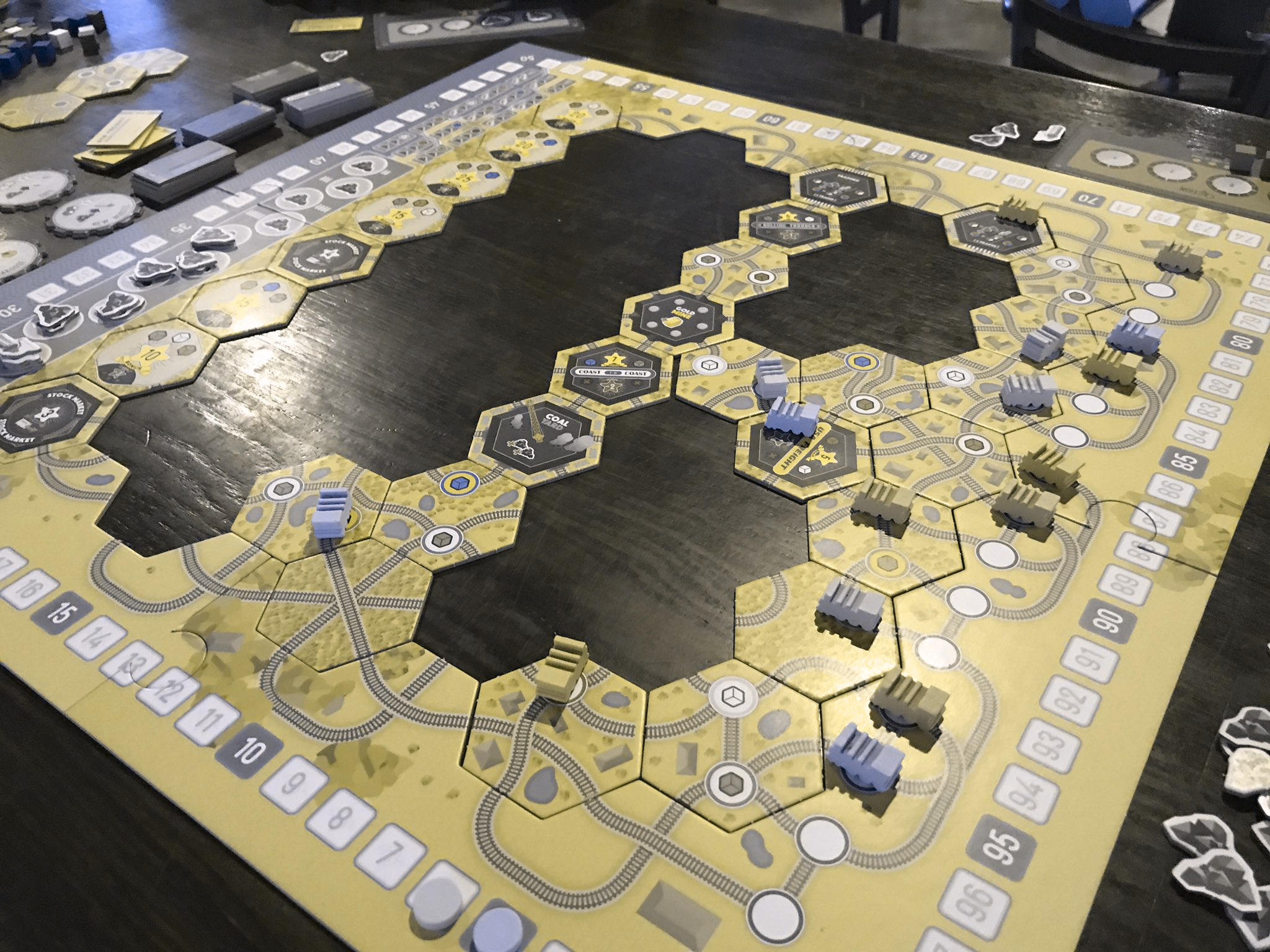
I decided to write this post after seeing the following tweet from The Secret Cabal:
Looking at the board I could see that the pastel shades might be a bit hard to tell apart, but I was curious to see how bad it was. I plugged the image into a handy colour blindness simulator I found on the web, and... yeah, that's not useful at all, is it?
There are actually many different kinds of colour blindness. This picture simulates Protanopia, or 'red blindness'. You can see other examples at http://www.color-blindness.com/coblis-color-blindness-simulator/.
If you're lucky enough to have decent colour vision, have a look at that image and think about what it's like to play the game in that state. Yeah, if you squint you can probably just about make out the differences (although I bet you'd be hard-pressed to tell the 'orange' and 'green' pieces apart), but there are several ways you need to look at a game board. Stepping back and getting an overview of the board state is vital in games like this, and not being able to do so can put a player at a distinct disadvantage. I'd even go as far as to say that, if this was my first time playing this game, I'd be keen not to play it again.
It's not just games with pastel colours, either. In hindsight I shouldn't have been as surprised by this as I am (after all, everyone knows that red and green are problem colours in this regard, right?), but check out how a brightly-coloured classic like Carcassonne looks through the filter:
Those meeples, from left to right, are yellow, red, green, black and blue. This filter simulates Deuteranopia, or 'green blindness'. Image borrowed from https://geekdad.com/2014/12/carcassonne-2/.
Yikes.
So with all that in mind, colour blindness is definitely something that designers need to think about. As I've already said, the industry is definitely starting to wake up to the issue, thanks in no small part to blogs such as Meeple Like Us, who do brilliant 'accessibility teardowns' on popular games. That doesn't mean the issue's fixed, though.
So, as a tabletop game designer, what can you do?
First of all, you can avoid relying exclusively on colours. I've noticed this tactic gaining traction in recent years - if a game requires each player's pieces to have a unique colour, adding a unique glyph or symbol is a handy backup for colourblind players. Some games go further - take Jaipur, which has a different colour for each of its goods, but also different artwork (note that the round tokens for each of the goods has a single element repeated from the artwork).
The actual colours of the goods cards are (top row) red, gold, silver, purple, (bottom row) green, brown. This filter simulates tritnopia, or 'blue-yellow blindness'.
Another thing that designers can do is use tools like a colour blindness simulator to look at their components through a different set of eyes - maybe even print them out using filtered colour sets so that the game's accessibility can be tested even if none of the playtesters are colourblind.
As for me, I've had this handy image by Steven Harder (a.k.a. @cog5games) stuck on the wall next to my desk for a couple of weeks now:
I keep looking at it, which is probably why The Secret Cabal's tweet resonated with me and why I felt the need to write a blog post about this whole thing.
So there you go. The more designers are thinking about this, the easier it's going to get for a lot of players out there. This is just one small part of the accessibility puzzle, but please spread the word, and take this into consideration when you come to designing your own games. I am very aware that I'm a newcomer to this topic, writing about something I've only recently started thinking about, so I'd love to hear some further discussion. If you've got your own thoughts on colour blindness in board gaming, or if you yourself are a colourblind gamer, please drop a comment below!
Thanks for reading :)


